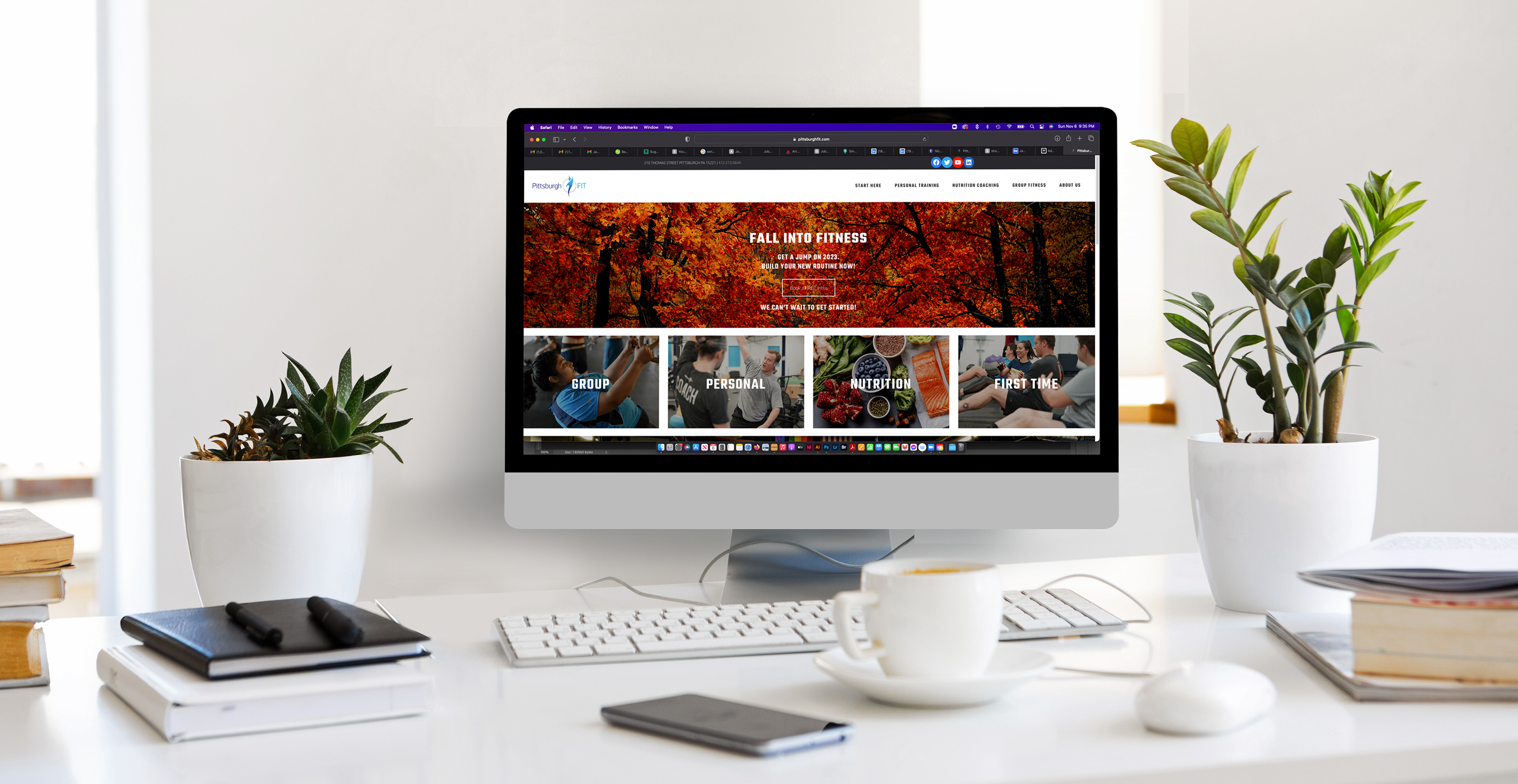
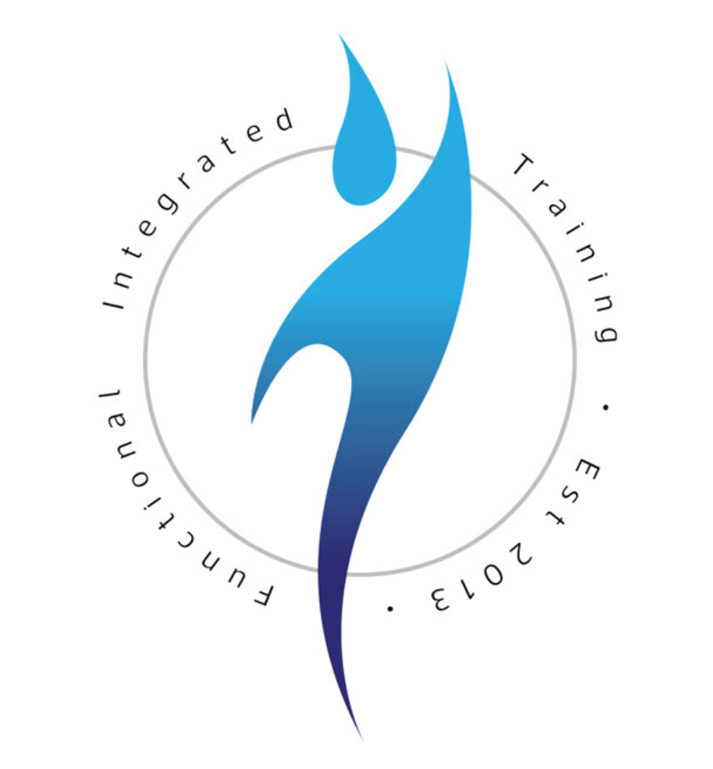
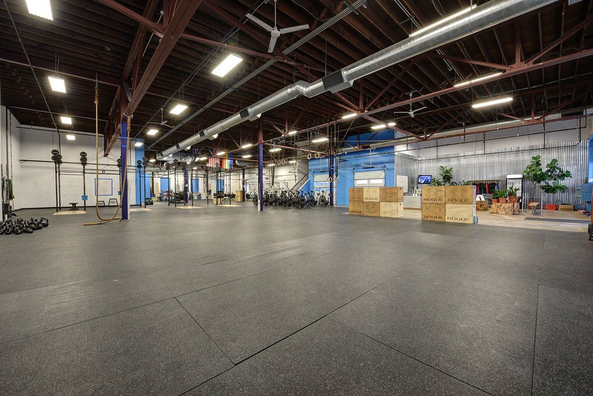
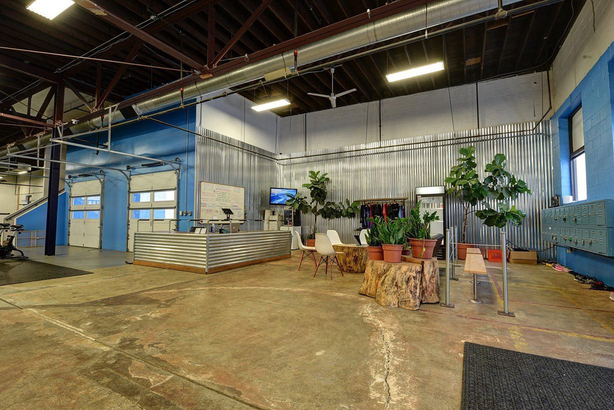
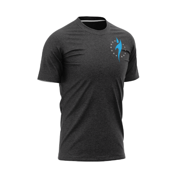
Over the course of 8 years, I spent long days, and then nights, updating, modifying and eventually rebranding Pittsburgh FIT, and designing the physical spaces in the gym itself. Our gym was founded on the tenets of inclusivity, community and instructional expertise. The icon represents the fire to succeed, something that the amazing staff at the gym works to show people everyday.
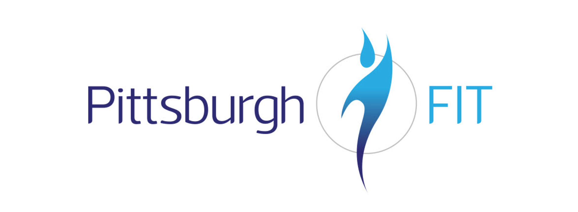
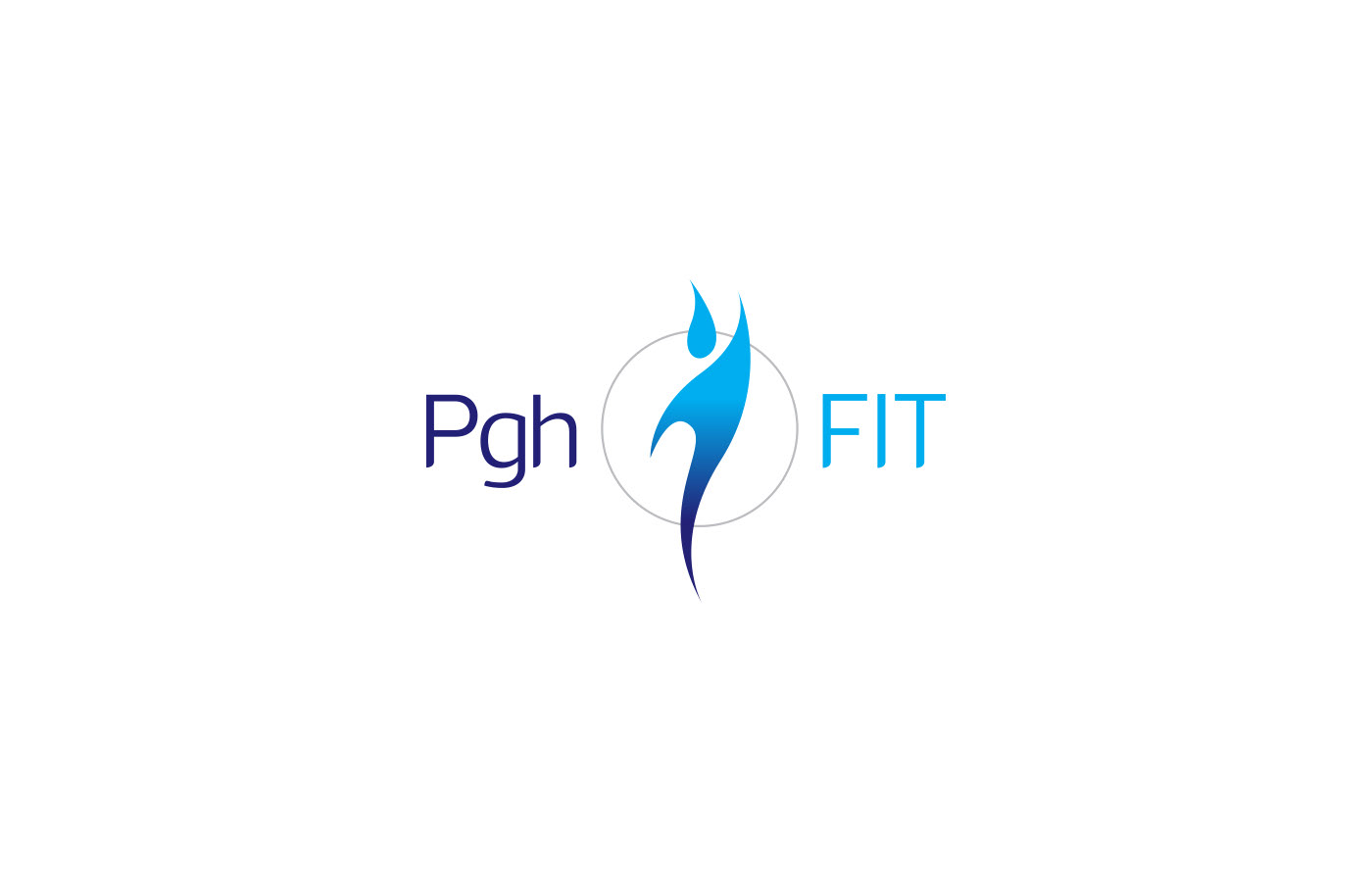
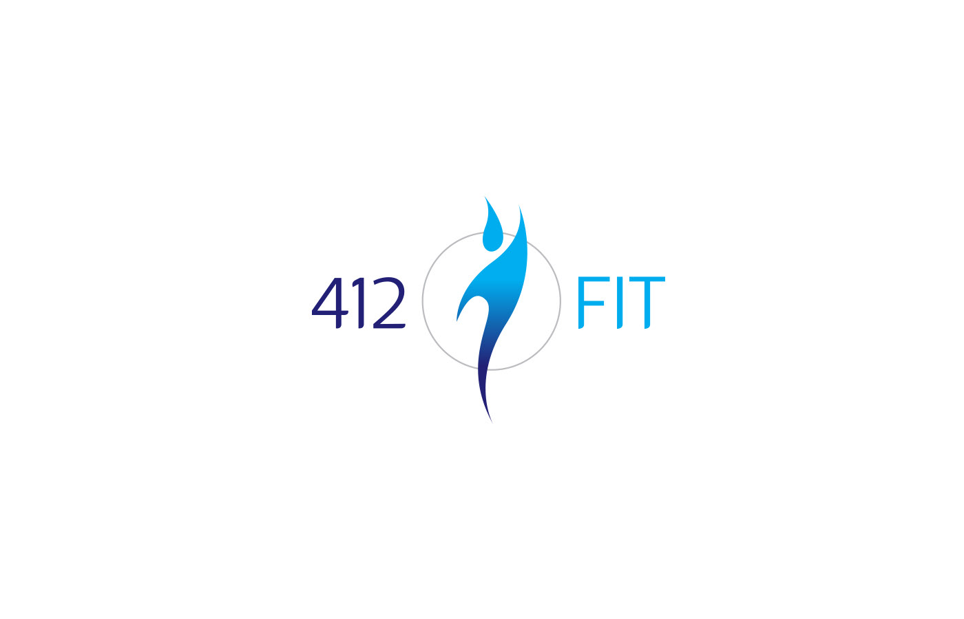
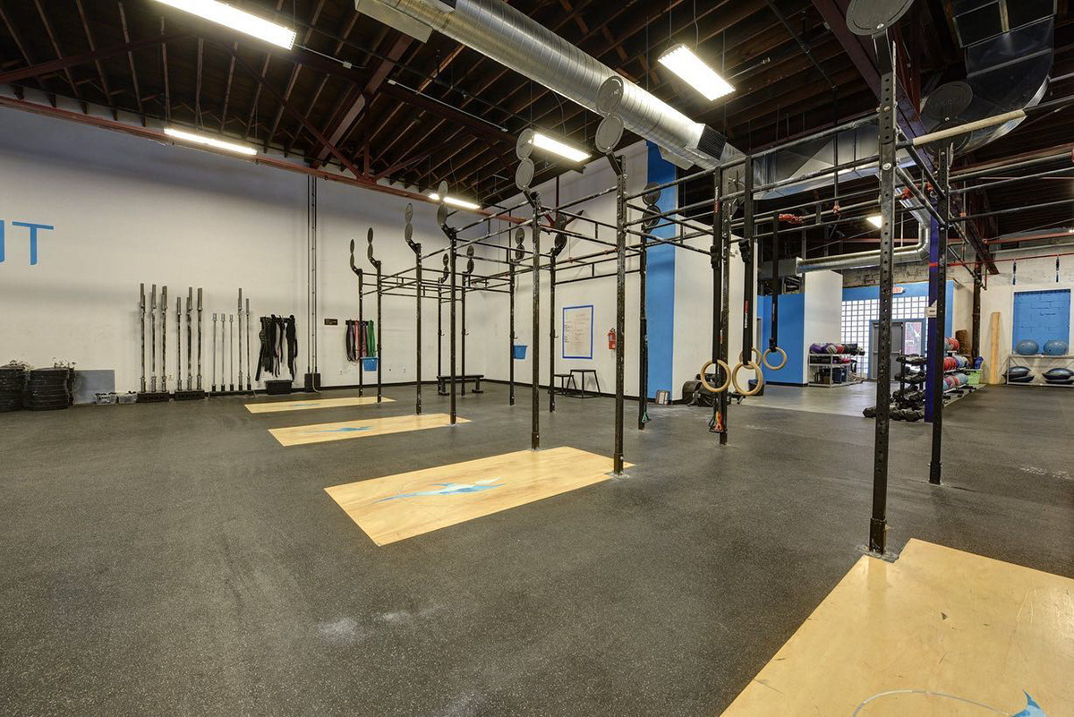
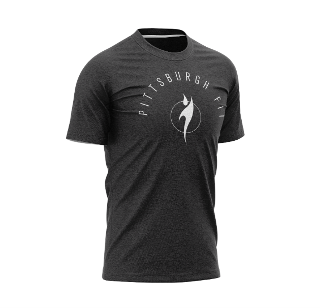
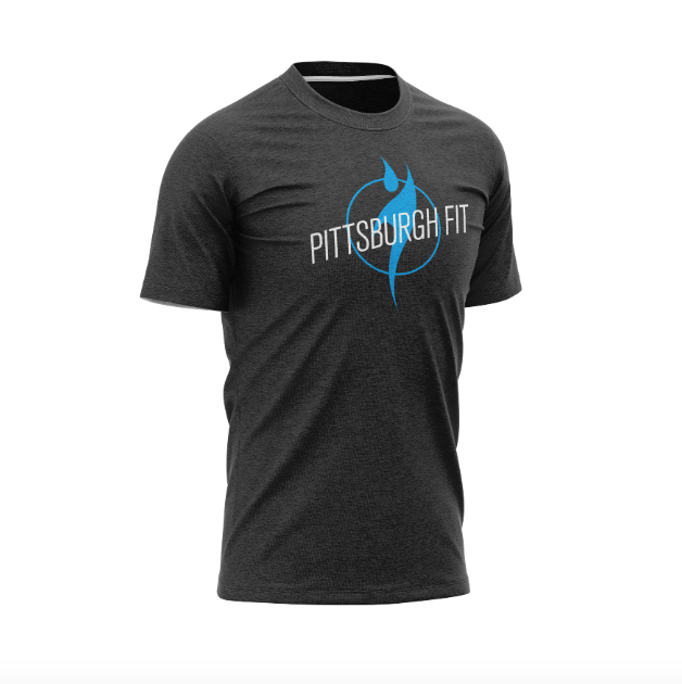
I love the simplicity of the icon, and I feel it's indicative of what you find in the gym - everything you need and nothing you don't. The typeface is loosely based on Acto, a versatile sans serif with a very tall x-height. I rounded the corners on the feet, finials and tails, and we landed on the strong, flexible, easily recognizable logo that you see today.
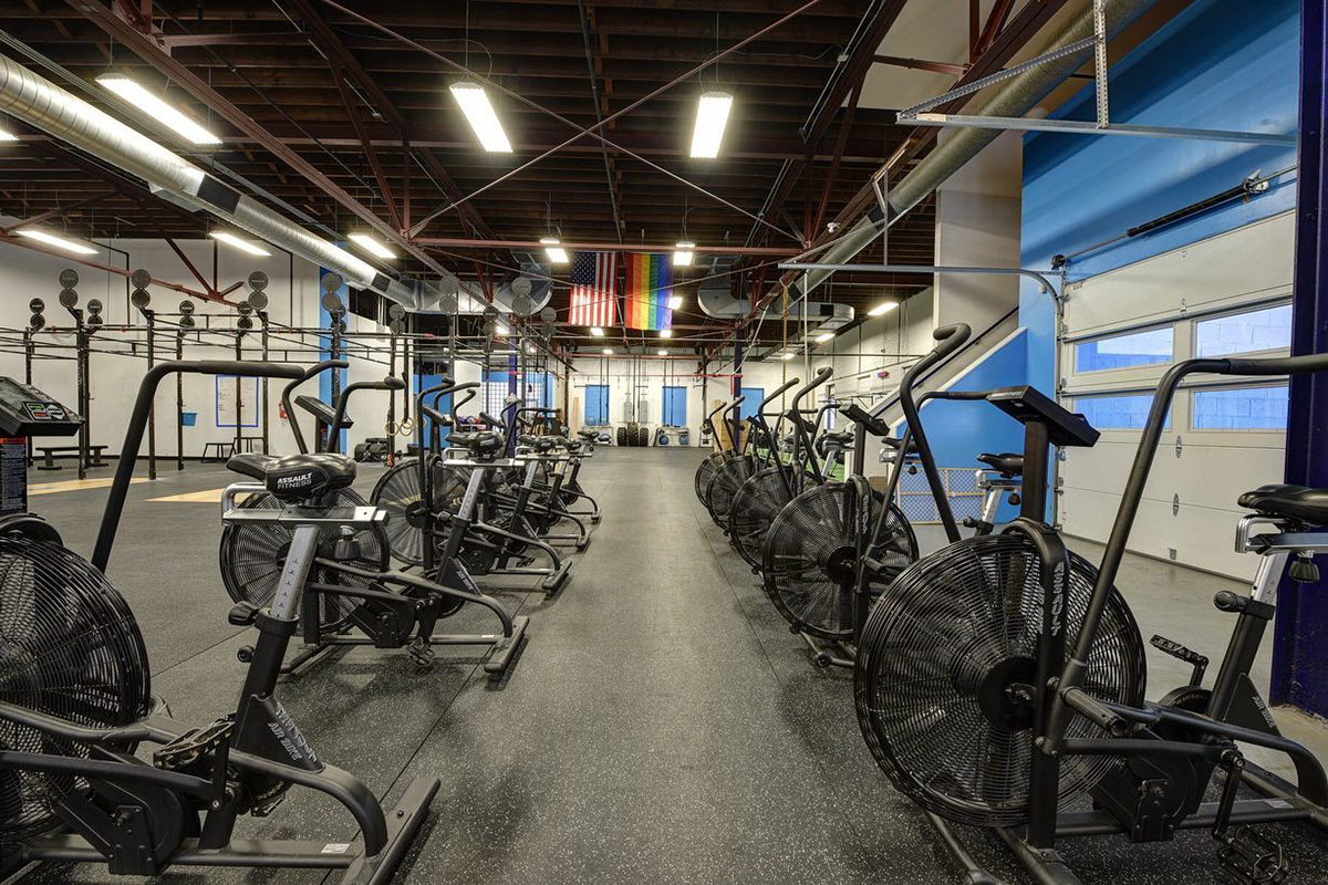
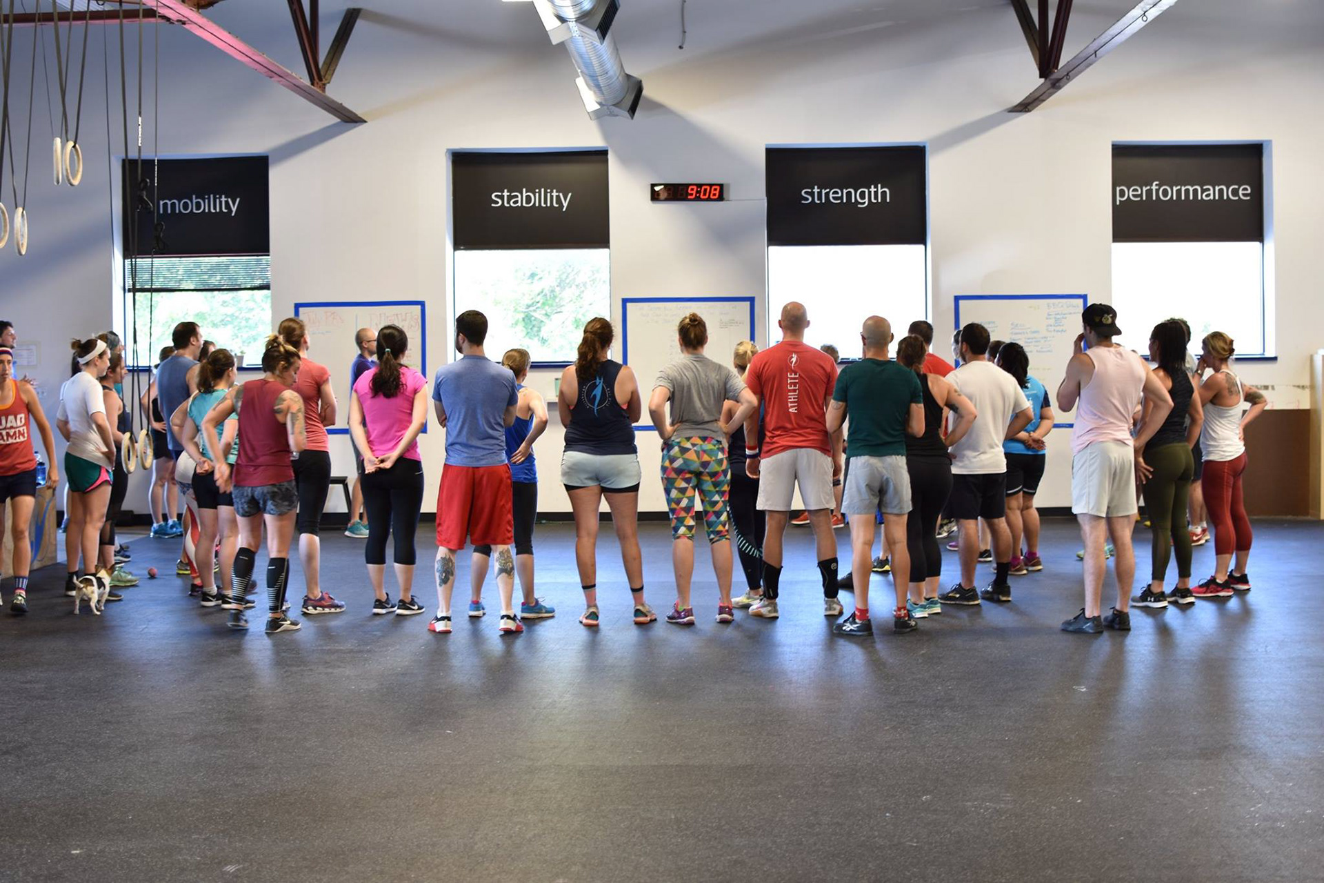


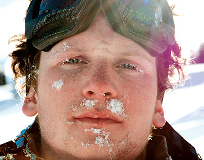
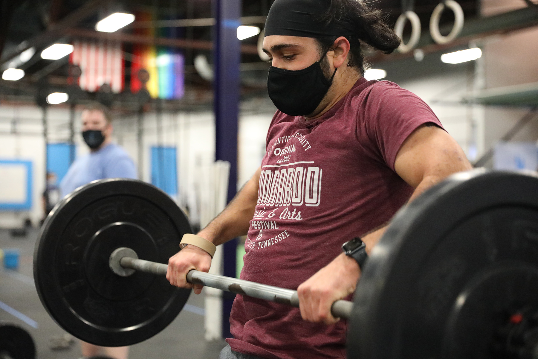
When we shot photography, we chose to use our own members. Partially because we knew that they would be able to hit the movements that we wanted, at the right intensity and with proper mechanics. The other reason, however, is because they were the heartbeat of the business. They represent everything that you could ever want in an athlete, a community member, and as friends.
I've since moved on from my role as the creative lead at Pittsburgh FIT, but I'm immensely proud of the work that came out of my time there and also of the business that we built.


You can visit the website and see what Pittsburgh FIT is all about HERE